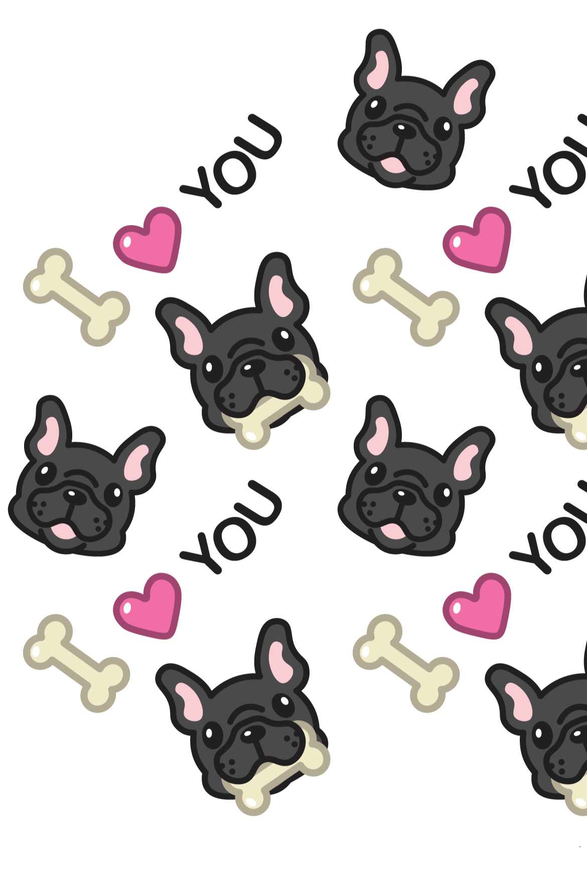
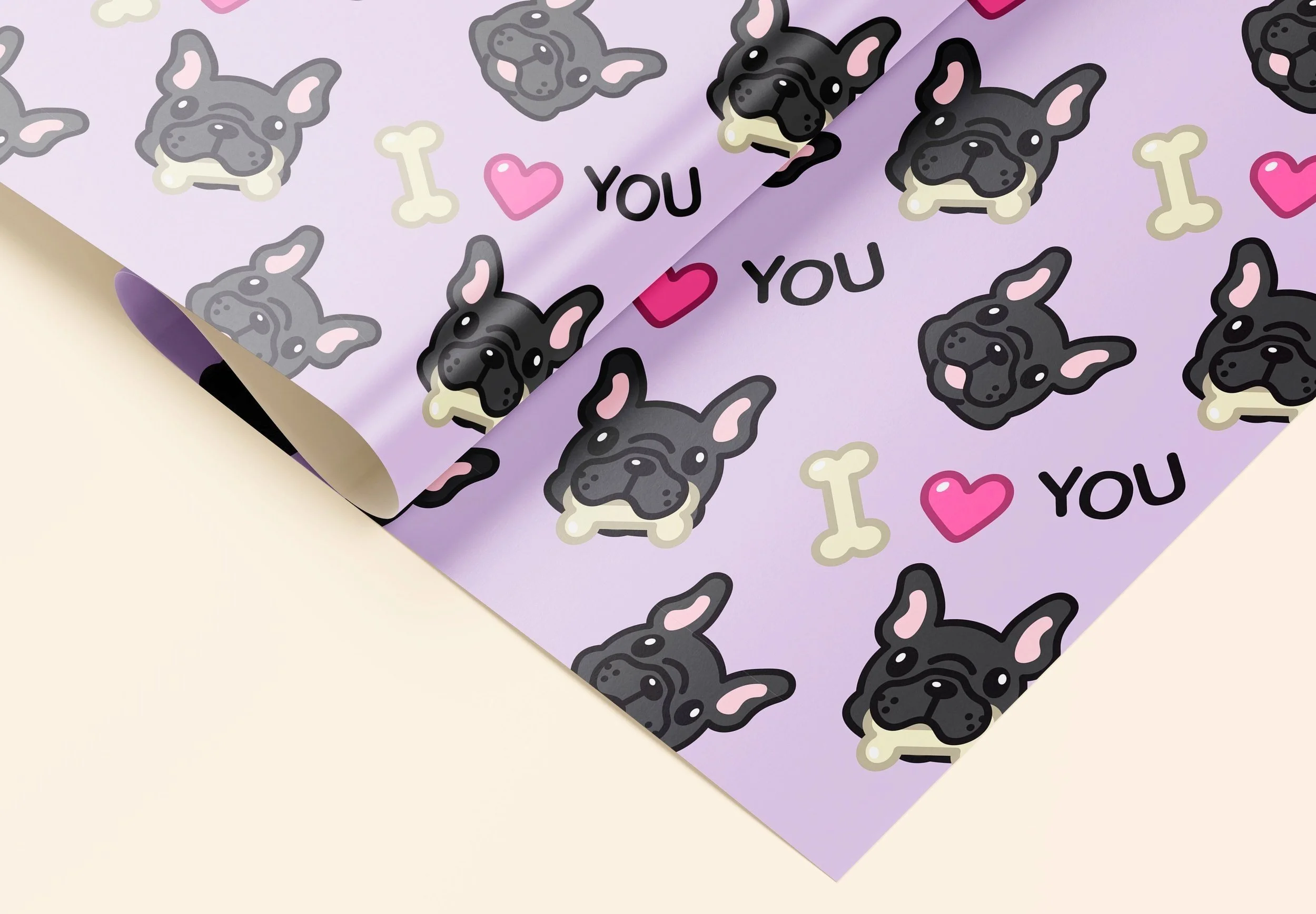
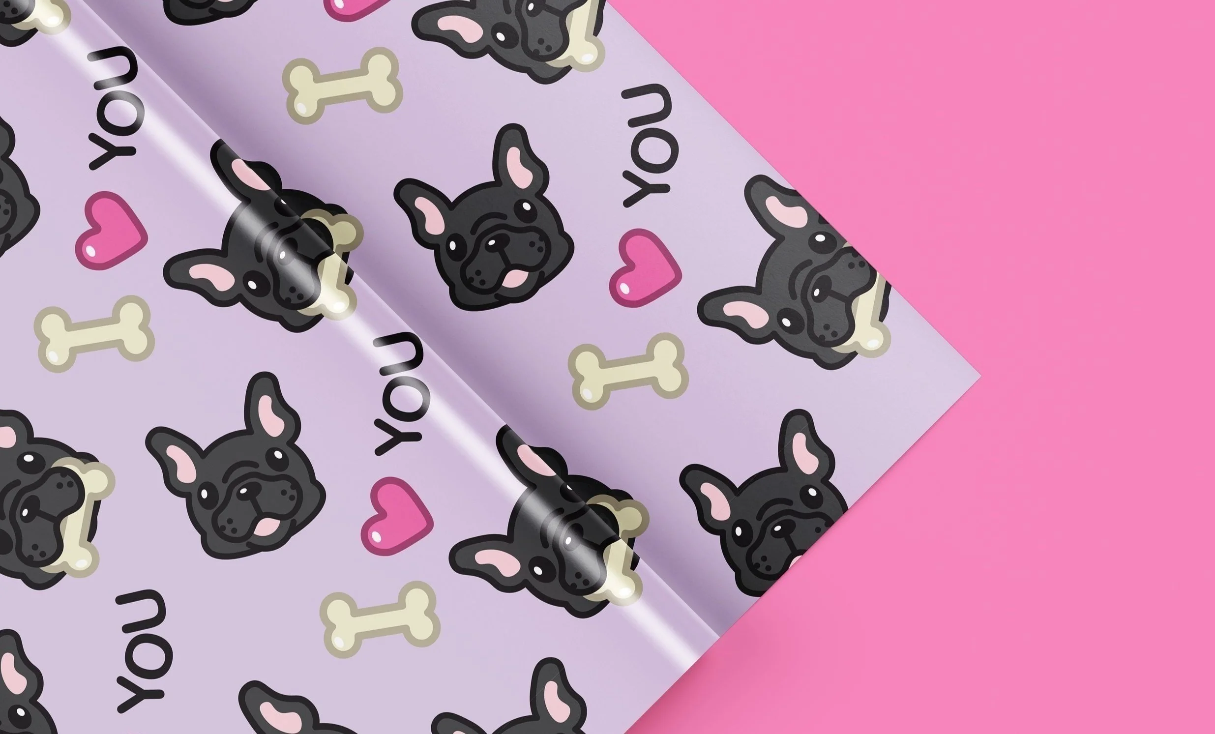
My w rk

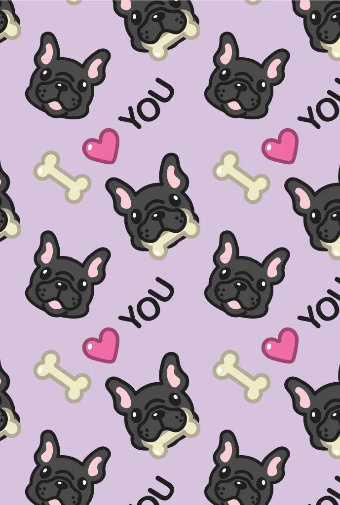
Color, type, and pattern project
Project Scope:
Design Research, Illustration, Color Theory, Line Cohesion, Contrast, Color Combination
Project Duration:
September 9, 2024 - September 25, 2024
Tools Used:
Illustrator, Photoshop, Miro
Prompt:
Create a clean, cohesive, and legible 11x17in wrapping paper design using illustration and include typography.
What I Did:
Designed a functional wrapping paper with consistent stroke and clean pattern using my knowledge of space and grids, and utilized color contrast to elevate the pattern.

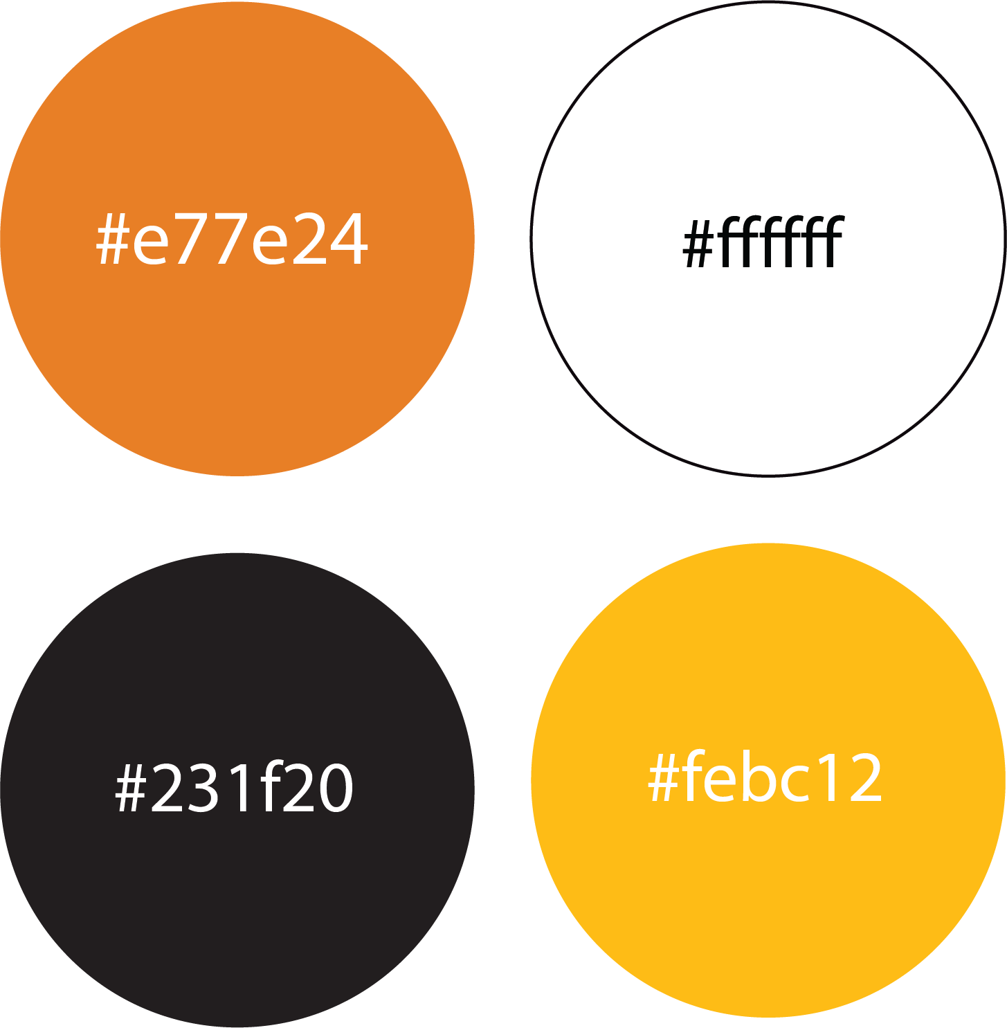
Color Palette:
Murder maze
Project Scope:
Brand Identity, Logo Design, Naming, Positioning, Packaging, Line Cohesion, Contrast, Color Combination
Project Duration:
October 21, 2024 - November 20, 2024
Tools Used:
Illustrator, Photoshop, Miro, Figma
Deliverables:
Logo (Wordmark & Brandmark), Business Card, and Packaging.
Prompt:
Pick a random business type, as well as two adjectives to embrace and one to avoid, to create an idea for a brand.
(Friendly and aggressive but not defiant greenspace)
Then design a successful logo/ brandmark for the brand that creates a visual language for the brand. Design, print, and assemble business card and packaging for the made up business.
Logo, packaging, and business card should reflect the brand’s essence in typography, graphics, and composition.
What I Did:
Created a logo that was cohesive in brand identity, color, linework, and typography that aligned with my randomly selected business type. Used color combinations, hierarchy, and typeface combinations to neatly design packaging and business card, then printed and assembled the packaging/ business card.
Color Palette:
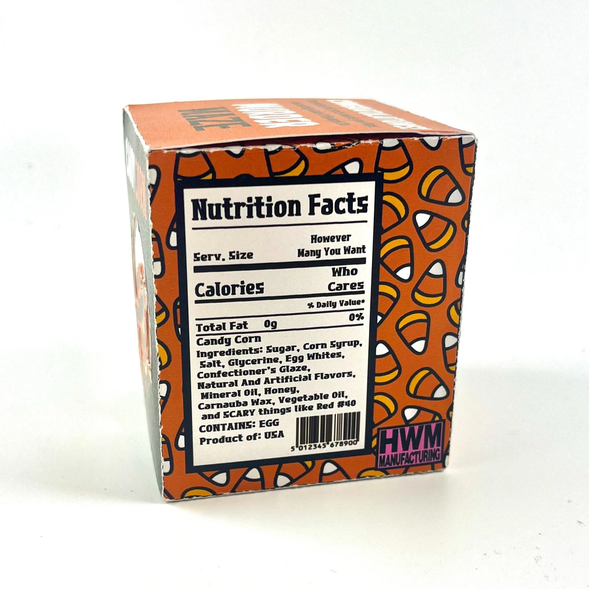
About Murder Maze:
Murder Maze is a friendly and aggressive but not defiant greenspace that features a haunted maze with scare actors all throughout.
When you get through the maze (if you make it out alive), you are rewarded with a box of Murder Maze candy corn!
Font:


Technical Illustration:

Source Image:


Color Palette:
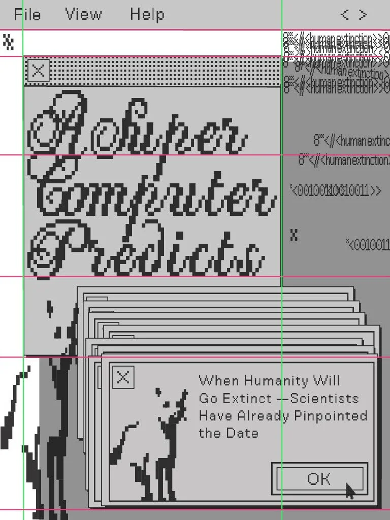
Newsletter grids project
Project Scope:
Typography, Grids, Layout Design, Shapes, Color Contrast, Printing, Cohesion, Texture
Project Duration:
February 4, 2025 - March 4, 2025
Tools Used:
InDesign
Deliverables:
Final Poster, and Zine (Mini Magazine) (4”x 5” folded and trimmed)
What I Did:
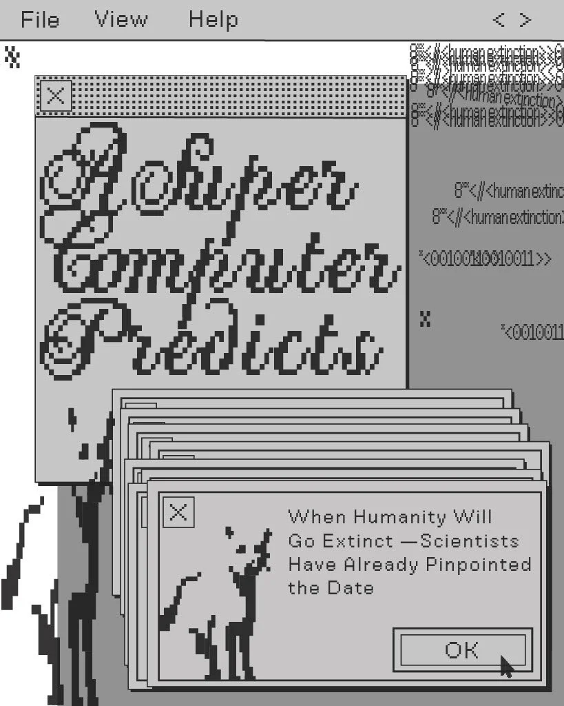
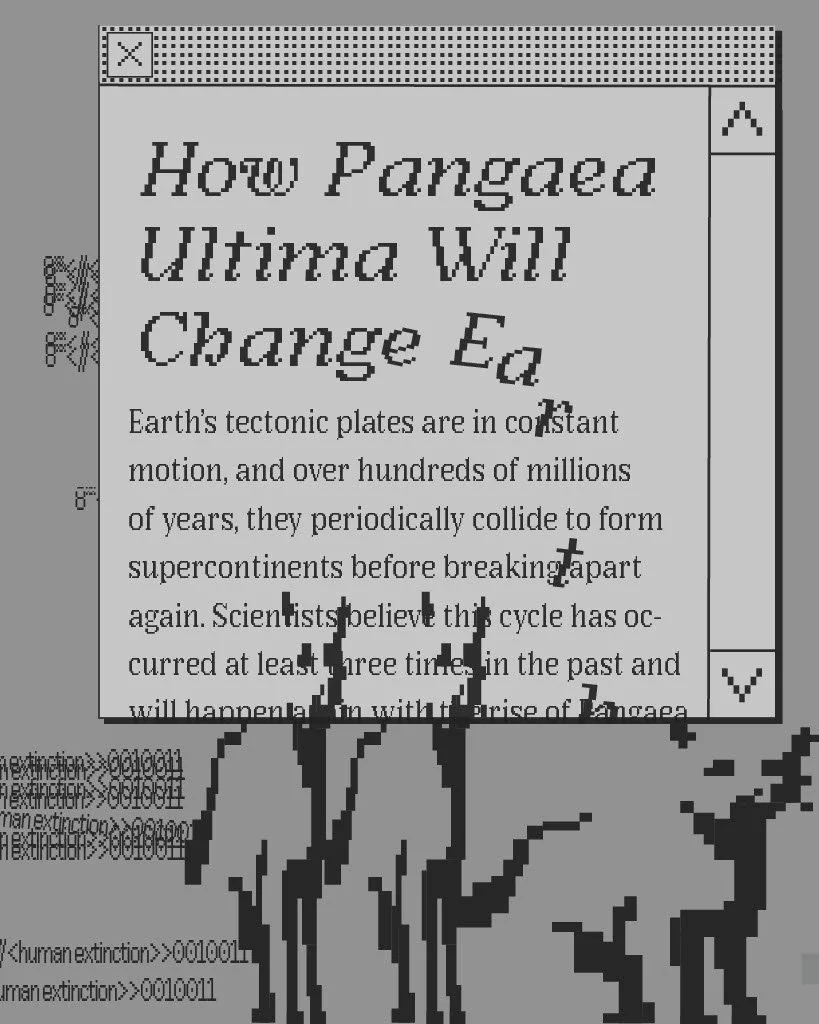
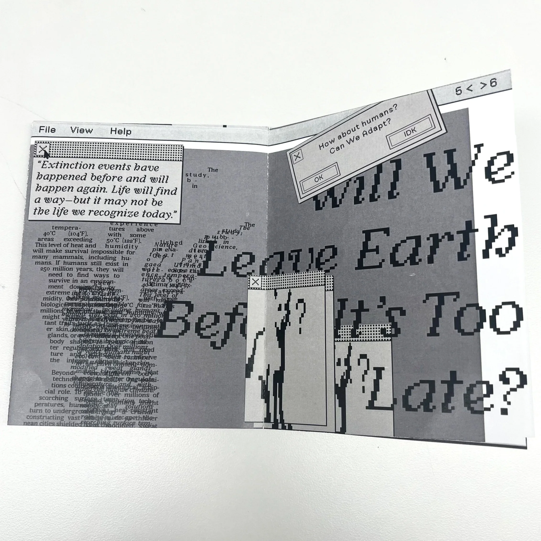
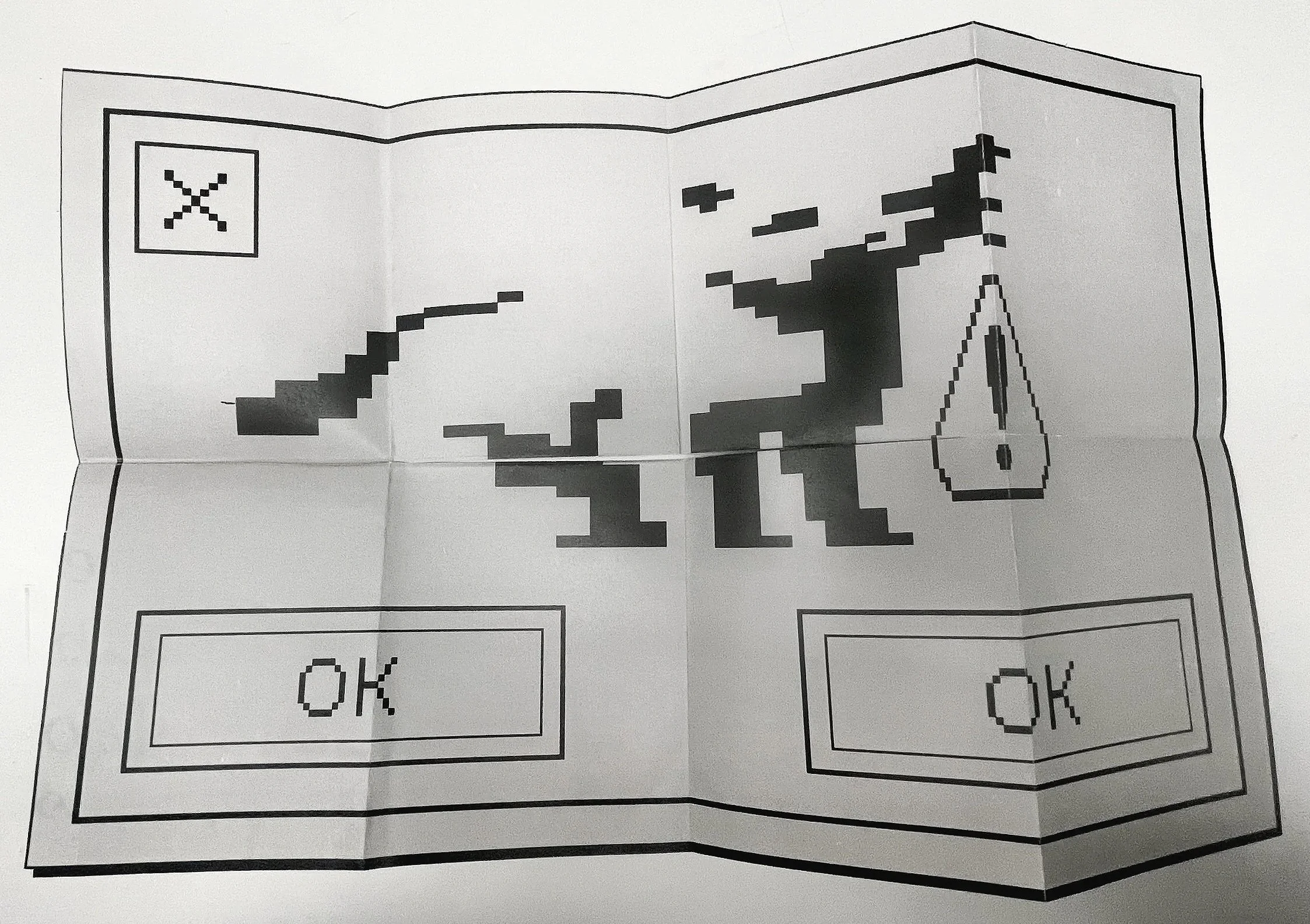
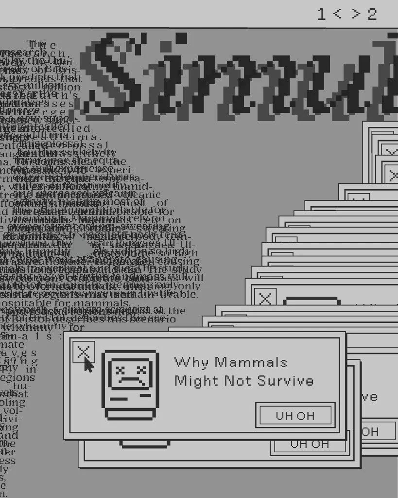
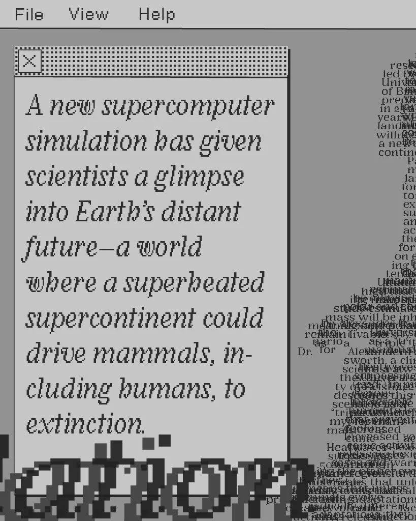
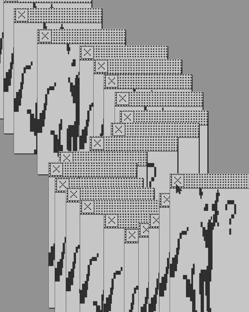
Brainstormed layout ideas using physical copies of cut and pasted columns of type that were run through printer scanners and drawn on. Used cut and pasted magazine typefaces to experiment with hierarchy (primary, secondary, and tertiary). Utilized these physical mockups to extract a grid with exceptional column use, and design a mini magazine and corresponding poster using that grid with type found from an article that interests me (Super Computer Predicts When Humanity Will Go Extinct). Printed and folded zine.

Digital:

Process Photos:

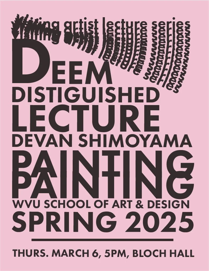
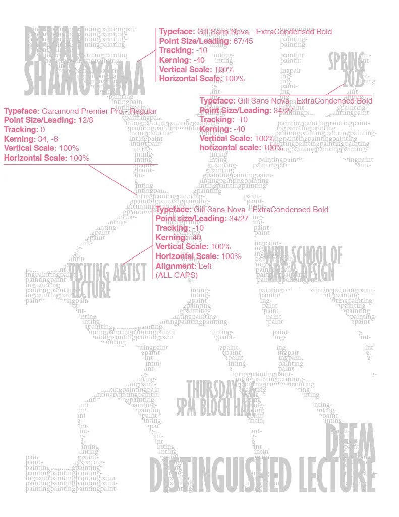
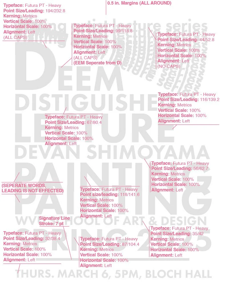
LECTure flyers project
Style Guides:
Data Diary
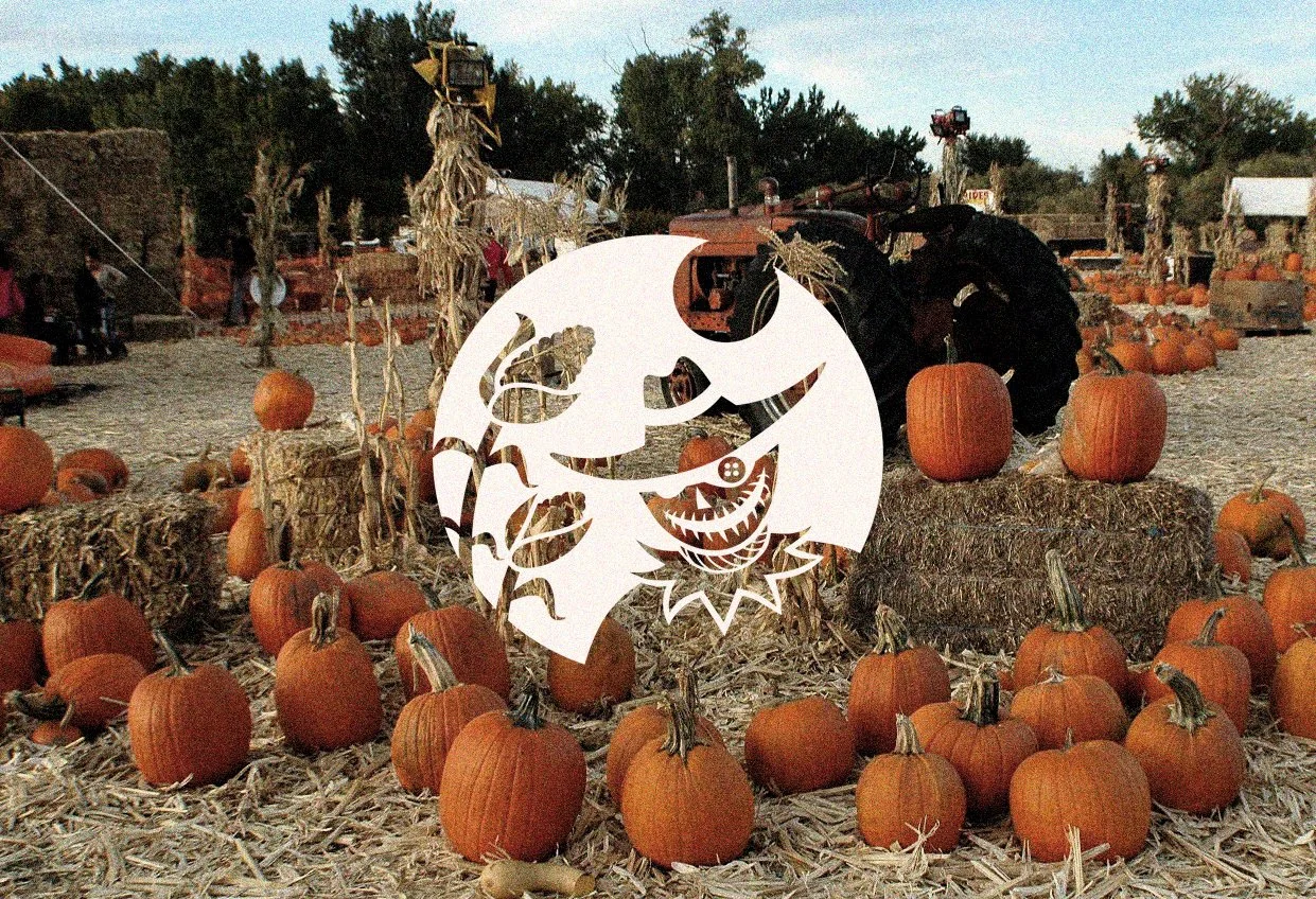
Technical Illustration Project
Project Scope:
Illustration, Color Theory
Project Duration:
December 9, 2024 - December 11, 2024
Tools Used:
Illustrator
Prompt:
Find a detail-rich image, recreate it down to exact details as closely as possible in Adobe Illustrator
What I Did:
Focused on technical accuracy to replicate my chosen image accurately. Focused on details, shading, and illustration.
What I Learned:
Even though illustration is my strong suit, this project still taught me a lot about the various illustration tools in Adobe Illustrator. I learned a lot about how to improve my drawing skills digitally and maneuver in a timely manner on Illustrator. This project is the most fun one I have done because I enjoy illustrating!
Pictograms and Iconography Project
Project Scope:
Illustration, Color Contrast, Cohesion
Project Duration:
September 25, 2024 - October 23, 2024
Tools Used:
Illustrator
Prompt:
Create a set of 9 pictograms that represent any medical field and the job they do (ex: gynecology, optometry, orthodontics, etc.)
What I Did:
Made 9 cohesive icons using the same line stroke, direction, style, shape, and color that simply describe the steps of surgery that general surgeons perform.


What I Learned:
This project taught me not to over-design and the importance of cohesive stroke and color.
I learned how not to risk sacrificing functionality/ legibility for illustration, and how to balance those two principles instead.


What I Learned:
This project taught me a lot about brand identity, repetition, and packaging. Printing and assembling the packaging was a challenge at first, due to the CYMK values not being vibrant enough once printed, but after fixing the issue, I know how to avoid problems like this in the future.
With more time and resources, I would like to re-print the packaging on a different type of paper, to avoid the white corners from pinched folds, and overall improve my craftsmanship.


Process:
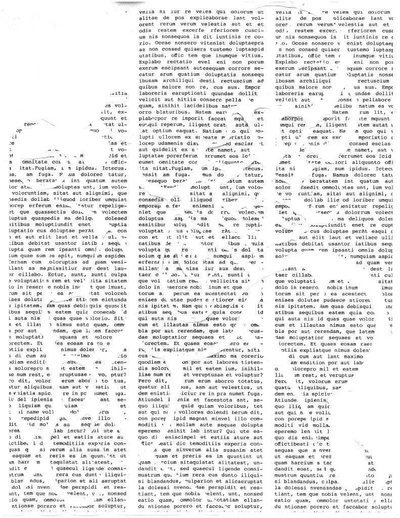
To develop grids and successfully handle white space, I first built and printed 6 different 8.5x11in grid structures using solid readable text and made variations in the number of columns, margin space, etc.
I then created white space by subtracting areas on the grid using white tape/ pasted white paper strips. To create 2 or 3 different levels of hierarchy, I cut and pasted magazine type over these created white spaces, keeping an interesting grid in mind.
These compositions were then ran through a printer scanner, and I picked 3 compositions to extract grids from. From those three, one was chosen to use as a grid for every zine page.


What I Learned:
This was my first project made using grids, and ever since I have fallen in love with grid use and incorporate them in every layout I do. The typography aspect was fun to do, especially when I got to create a theme based on the article I used!

What I Learned:
Collecting data is something I never really thought about converting into design before, but now I understand how shapes and colors affect the way we read data. Arguably, data expressed through color and shapes (when well-designed) is more functional than simple readable data.
What I Learned:
I learned the importance of line cohesion and simplicity, and how to let go of small details and look at the bigger picture.
Project Scope:
Typography, Layout Design, Cohesion, Texture
Project Duration:
January 16, 2025 - January 30, 2025
Tools Used:
InDesign
Deliverables:
3 Final Printed Posters (8.5 x 11in, .5 margins)
Prompt:
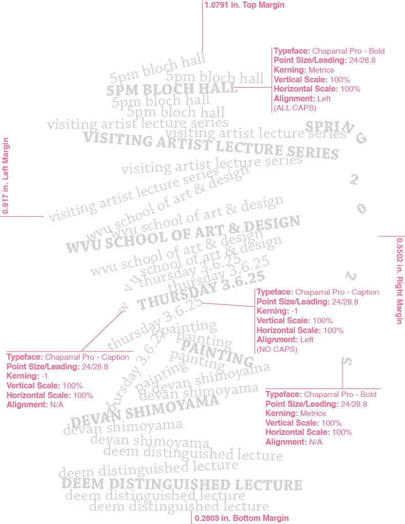
Create 3 different posters for the West Virginia University Visiting Artist Lecture Series. Use only typography (no illustrations). Use variation in scale, weight, tracking, and case.
Make several versions of each lecture flyer using the following typographic conventions:
All type is the same point size and font family. You may use different weights (light, condensed, regular, italic, bold, black, etc.)
All type is the same font and weight. You may change the point size.
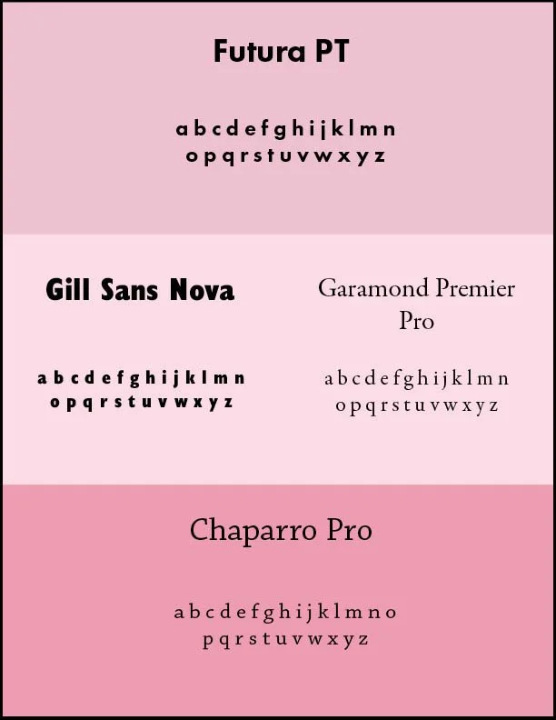
Pair type (choose serif and sans serif) no other restrictions.
What I Did:
Created clean poster layouts using font combinations, different scales, typefaces, weights, styles, tracking, and cases.
What I Learned:
Typography is one of my favorite aspects of graphic design! While some people would find the rules in this project prompt challenging, I found it fun to find ways to bend the rules, all while getting to use typefaces to create an interesting composition.
Project Scope:
Data, Typography, Graphics, Illustration, Shape, Color, Direction
Project Duration:
March 3, 2025 - April 1, 2025
Tools Used:
InDesign, Illustrator
Deliverables:
Final Printed Poster (18 x 24in, gloss paper)
Prompt:
Collect data (I tracked outfit color combinations that I saw on WVU campus)
Use color, shape, line, direction, contrast, and pattern to design a compositionally interesting poster that represents data collected. Include a name for your poster and a working key for the data.
What I Did:
Designed a poster using unique shapes and created texture using typography, while keeping the data legible. Used mostly color to track outfits I saw on campus and included shapes to clarify detailed data (all specified in the key).